
Poster of a Girl - 2012 Edition: Uma Thurman 2:0, Halle Berry 1:1 [2012 Week]
/
In a close battle between an album or movie posters from 2012, posters won. Why? Because posters are slightly more fun, even if it meant browsing through lots of posters from that year (take a look yourself). I don’t write about all of them, obviously, but just a selection of the good, the bad and the most photoshopped.
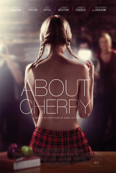
So, I understand that this movie is about the porn industry in some way. I’m definitely not saying that you have to be critical of porn movies but I think you have to be aware of its problematic issues. Showing a poster with a very titillating image of a young, seemingly innocent but half-naked girl is certainly not the right way to approach it. All this image does is saying “You wanna see the movie with the hot chick?” It’s a sexy image, sure, but without any counterbalance to give it some critical approach.

Oh, this is so awful. This poster wants to have it both ways. It wants to say that all those other action movies are nonsense, because they are not real, but it also wants to come across as an exciting movie itself. But the fact that it features real-life Navy Seals shouldn’t make it an exciting movie. This sounds like a military recruitment ad more than anything. “This is no game, so come and join us to fight unnecessary wars and get killed or maybe just damaged for life.”

This poster confused me so much that I had to look up what it was about, to confirm my suspicions. Yes, this movie actually is about the cop Alex Cross, played by Tyler Perry and the huge, looming figure of Matthew Fox is inappropriate because he plays the villain. Does that become clear from the poster? Could it also be the other way around? Is there any reason not to stage Perry as the main character and to put Fox somewhere in the background?

Sure, most of all this is another really lazily made poster that makes it obvious to anyone with a brain that none of those people was probably in the same room for that picture and that it’d be physically impossible to do as the poster implies. It’s more men than women, but let’s ignore that. Again, let’s check what the men are doing and the women are doing. The men are all simply smiling or laughing, except Jason Biggs, who looks slightly threatened. By what? Well, by Alyson Hannigan and the baby bottle of course. Because women, you know, always threatening men with family ideas. At least Tara Reid shows some cleavage, so there’s diversity.
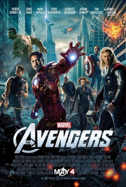
This probably has been talked to death already, but still. Sure, there could have been more women in the Avengers as there are enough candidates. But for being the only woman, Black Widow (Scarlett Johansson), she is positioned relatively well. She is on her own, does no sexy pose and is more visible than Captain America and Nick Fury.

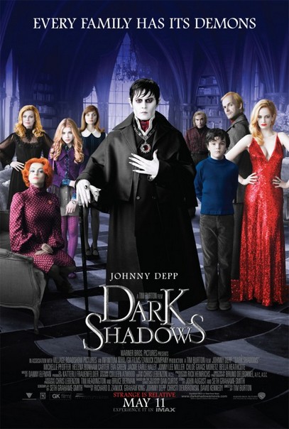
Four pillars, the man (Robert Pattinson) gets all of them and one woman is left for each other, but they all look at the man. Okay, Uma Thurman looks at us, but still, it’s a weird, very male-centric poster.

I have a problem with the movie, but the poster is pretty great. Not too much of a female possessing male attributes, just a cool girl being front and center, not even fulfilling all beauty ideals.

What a nice diverse cast and poster that shows it off. Sure, the order goes mostly by fame as Tom Hanks is the most prominent, but Halle Berry is pretty big too and Doona Bae is right in the front, showing maybe a somewhat much legs, but still. I’d call it a success.
There is a majority of women here, but I’m somewhat creeped out by two of them doing the hands-in-hips-pose. It’s so weird and unnecessary, women pointing out, here is my hip, this is what I am. Men don’t seem to need to do that.

Oh man, that’s… gratuitous. I mean, how could you not look at that fin?

I love that poster. It’s a great, strong image of a strong woman dominating a man. I know, I’m not the biggest fan of females being strong because they have male attributes, but the poster is so effective, I tend to ignore it. But, there is also this version:

It’s not the official poster, but it’s incredible, right? Someone must have said: “We must have all our stars on the poster!” So we get this row of six male faces dominating the poster of a movie that is all about the obscured woman in the background. This reminds me that I could do a whole post just on alternative poster versions.

Again, I don’t know who thinks anyone wants to see posters that look as unreal as this or who needs taglines that make absolutely no sense, but all I really wonder is why Vanessa Hudgen’s breast looks bigger than Dwayne Johnson’s head.

There are many candidates for absolutely horrifying photoshop disasters, but this one is representative enough I guess. The facial expressions, the physicality of holding the kids, the weird size differences. But what also fascinates me is that idea again that kids are inherently dangerous or difficult. But… sorry, I can’t concentrate, I look at Billy Crystal’s hands and I just can’t grasp how anyone thought this doesn’t look freakish.
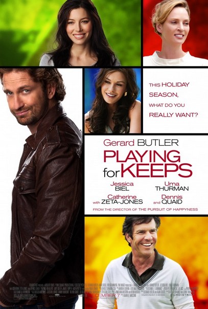
Very similar to Bel Ami, this one has Gerard Butler inhabiting the majority of the poster and some women (who I wouldn’t necessarily recognize as the famous actresses they are supposed to be) adoring him. Including again Uma Thurman looking the other way. What a pattern.
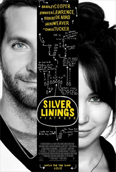
Finally, another winner. I really like this movie and you could make a convincing case that this is Bradley Cooper’s movie, but the poster gives him and Jennifer Lawrence equal treatment in every way. They really deserve it.
Similar posts:
