
Poster of a Girl - Photoshop Abuse, Sin Kids and Gender Math
/It’s time for posters again! Last time I non-scientifically looked at some posters from the IMP homepage, I found some questionable portrayal of women there, unsurprisingly. Well, today I do the same, grabbing some posters from the site that got my attention.
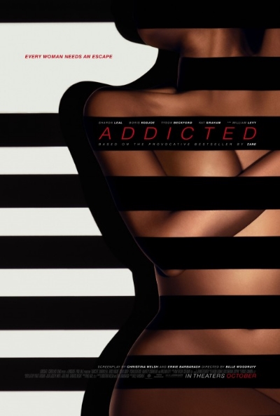
The first one is intriguing and puzzling at the same time. We see basically naked woman, barely covered with some black stripes, while one of it is tied pretty tightly around her neck. It’s a half-naked woman, so it’s hard not to find this exploitative. The tagline, though, says Every woman needs an escape, which gives the image a slightly different feel. But what exactly? What they need to escape from? Are the stripes supposed to represent imprisonment? I think the image is purely a way to provoke attention, because it’s a nude woman, so most people won’t think for a second about what it means. The tagline makes it slightly ambiguous, but it’s too unclear to be convincing. The title and the phrase “based on the provocative bestseller” don’t really help, implicating even more that it is about sex.
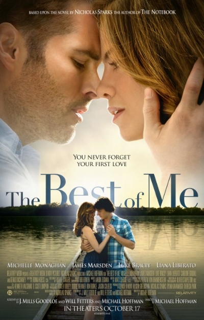
I’m really trying to be fair here. This poster is cheesy as hell, but it gives the man and the woman equal focus and the actors’ listing starts and ends with a woman too. I’d mostly give this a pass, but there’s still the hand on the woman’s head at the top and the arm around the woman below. Both are held by the men, giving them a slightly stronger image.

It’s hard to talk about this poster without mentioning that it looks horrible. That’s what “photoshop disaster” was coined for. Everyone looks weirdly in all directions, the gun looks very awkward (and is edited out in another version), the colors are extremely extreme and the tagline is just dumb. But it features Susan Sarandon right in the center as a strong woman, so at least the poster gets this aspect right.

Oh, you know who is evil? Kids. Especially girls. They are, ha ha, “sin.” This is a trope used far too often and reminds me of the problems (or not) of The Conjuring. There is something disturbing about this poster and not in the scary way it wants to go. The girls are exploited to appeal to our fear of children and females, implicating an inherent connection to sin (not “I have sinned” but “I am sin”) and also referring to the patriarchic order of things with the enormous tagline.

It is really amazing how awful some posters look because people are paid to do this and you would assume that it is a job, you’d want to have. Movie poster designer is a pretty cool thing. Anyway, as awful as this looks, it features three women out of five characters, but they all look scared and in need of help, which is probably provided by what I guess is Nicolas Cage. There is a man standing around too, looking confused, but it’s interesting that his name comes up first in the credits and then the three women. So they are (yes, I’m doing it) left behind – twice.

This is interesting but also weird. It features two women who look happy and confident, so this is all a plus. The tagline says “One guy can ruin the perfect relationship”, which could indicate that the guy is bad for the relationship or that the relationship is not “healthy” anyway. It’s very ambiguous, but you have to give the poster credit for not showing the guy.
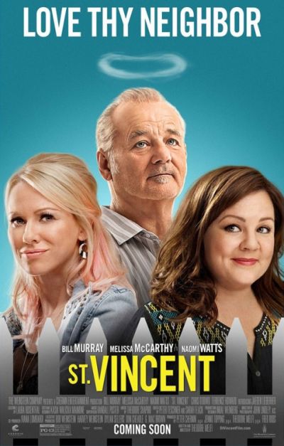
Oh man, these actors really deserve a better poster but it looks so awful and cheap, the composition, the expressions, the fence, the halo. It also, and that’s the worst thing a poster can do, doesn’t give you a clear indication what the movie is about. But it does what so many other posters do: it puts the man in the center and although there are two women, they are positioned in a lower position than him.

I might be stretching here, but although this poster has far more women than men, somehow the men dominate the poster anyway. Jason Bateman gets the front row (okay, he probably is more known than Tina Fey), Corey Stoll gets the center position and Adam Driver gets to sit on the chair in a cool way. There are five women, but they all do nothing special and function more like a filler between the men. Two of them are squeezed in between the men and the other three stand around in the background. It’s so weird how the posters can increase the amount of women (here it’s almost too much), but still not focus on them. Three men + five women still equates three men.
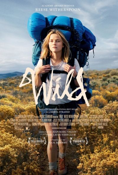
And finally, a good one. No stupid tagline, not awful photoshopping (okay, a little), just Reese Witherspoon front and center and the title. This isn’t so hard. Of course, without many movies with women in lead roles there can be no posters showing them, but it is so refreshing to see some of them now and again.
That’s it already. What have we learned? Hopefully to continue being observant about these things. It’s just a movie poster and it can make you want or not want to see a movie, but it’s also a cultural artifact with a meaning. But you knew that already, didn’t you?
